
Reproducing a published trajectory analysis plot with Cellenics®
A very interesting feature that was recently added in Cellenics® open source scRNA-seq data analysis tool is trajectory analysis. You can try out this new feature for free in the Biomage-hosted community instance of Cellenics®. But what exactly is a trajectory analysis?
It’s all about determining a pattern of a dynamic biological process experienced by cells or, in other words, a "trajectory" of gene expression changes. Then the cells are arranged according to their progression through that process, which means that they are placed at their proper position in the trajectory.
But how can we quantitatively measure this progression? Well, we can do it using the so-called pseudotime. This concept was introduced by Monocle, an algorithm developed by the Cole Trapnell Lab [1], and it is defined as “an abstract unit of progress: simply the distance between a cell and the start of the trajectory, measured along the shortest path.”
To show how Cellenics® can be used to perform a trajectory analysis in a very easy and reliable way, we reproduced the findings from a paper that was recently published in Science by Shi et al. [2] using the Biomage-hosted community instance of Cellenics®.
“Mouse and human share conserved transcriptional programs for interneuron development” by Shi et al. (2021)
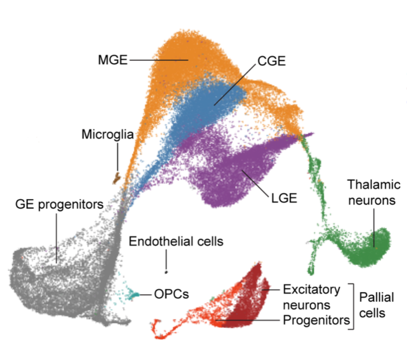
The authors investigated the transcriptional trajectories of cells in the developing human ganglionic eminences to assess conservation in the genetic programs controlling the development of GABAergic neurons in mice and humans. There are a lot of interesting findings in this paper, but for the purpose of reproducing a trajectory analysis plot using the Cellenics® tool, we will focus only on a few of these findings.
In the first part of the paper, the authors describe how they identified 10 different cell types within 56,412 cells coming from 9 samples of dissected ganglionic eminences across gestational weeks (GW) 9-18. This is the UMAP figure from the paper that represents the cell types that they identified:
The authors annotated these cells manually, using the expression of some known marker genes, as shown in this figure from the paper:

Next, they decided to focus on the ganglionic eminences (GE) progenitors cluster with the goal to investigate 2 types of progenitors inside this cluster: radial glial cells (RGCs) with neural stem characteristics and intermediate progenitor cells (IPCs), which derived from RGCs and are committed towards the neuronal lineage. Here you can see a new UMAP from the paper that includes only RGCs and IPCs identified within the GE progenitors:

Once again, they exploited a list of established markers to identify these two cell types of interest:

And here comes the interesting part! They performed a trajectory analysis using Monocle3 to visualise the developmental trajectories of RGCs and IPCs using pseudotime alignment. This nice plot from the paper shows a trajectory that starts from the less differentiated RGCs and follows a path that ends at the more differentiated IPCs:

Sure, this is not the most exciting finding in this study, they just confirmed that there are some cells in this experiment that are differentiating from a more stem cell state to an intermediate progenitor state. But this seems like a clean example to exploit for our purpose. Remember: here we would like to see how to perform trajectory analysis using the open source data analytics tool, Cellenics®.
So, let’s jump to the fun part. What did we do to reproduce these findings?
Reproducing the analysis using Cellenics®
Demultiplexing and uploading the data to the Biomage-hosted community instance of Cellenics®
First, we downloaded the data from here [3]. Specifically, we downloaded the file named “GSE135827_GE_mat_raw_count_with_week_info.txt.gz”, which is a raw count matrix including all the samples. This means that, as a first step, we needed to demultiplex the data to obtain matrices corresponding to each sample, and then convert the raw counts to 10X files (the input format accepted by the Cellenics® tool).
How do we do this? We have previously written a tutorial that contains instructions and associated R code for doing this, you can find it here in our blog. The tutorial must be adapted a bit, as in this case we have the data as a .txt file instead of a .rds file, and the sample names are not encoded in the prefix of cell barcodes, but in the suffix. But after these couple of minor adjustments, we obtained 10X files for all the 9 samples reported in the paper. To skip this step, demultiplexed data can be downloaded from here.
For the sake of truth, the downloaded dataset included an extra sample containing only 46 cells. Considering that this sample was not reported in the paper, and it included a very low number of cells, we decided to exclude this sample from further analysis.
Processing the data
After uploading our samples to the Biomage-hosted community instance of Cellenics®, processing them was as easy as clicking the “Process project” button in the Data Management module. After a few minutes, we had our analysis ready to be explored.
Before proceeding further, we changed the integration method from the default Harmony to the one used in the paper: fastMNN. We also modified the cluster resolution. This value was not reported in the paper, but, luckily, trying different values in Cellenics® is very easy: it’s just a matter of moving a slider. In the end, we decided to use a resolution of 0.1 because it produces a number of clusters more similar to what is reported in the paper.
Annotating cell types
Having our data ready to be explored, we aimed to first identify the same cell types that the authors identified in the published paper. To do this, we looked at the expression of some key genes reported in the paper. Specifically, we used MKI67 to identify GE progenitors, LHX6 for MGE, NR2F1 for CGE, MEIS2 for LGE, TCF7L2 for thalamic neurons, and NEUROD2 for pallial cells.
Plotting the expression of these genes on the UMAP produced by Cellenics® was very straightforward. We searched for the genes in the gene list present in the Data Exploration module, and then clicked on the little eye icon next to the gene name to view it on the UMAP embedding plot. Then, to export these plots, we did the same using the Continuous Embedding module in Plots and Tables. Here are the results:


Using the expression of these marker genes, we identified the same 6 main clusters reported in the paper. We didn’t annotate 3 minor clusters (microglia, OPCs, and endothelial cells) because we didn’t find strong marker genes reported in the paper for those clusters. We didn’t investigate further because they’re very small and not relevant for the following trajectory analysis.
Here is our annotated UMAP produced with Cellenics® (A) compared to the UMAP form the paper (B):


The shapes are slightly different, and that’s perfectly acceptable considering that UMAP is a stochastic algorithm, which means it makes use of randomness. However, we can observe that the relative positions of the clusters are concordant between the 2 plots. There is a big grey cluster (GE progenitors) which is connected to 3 main clusters (MGE, CGE, and LGE), then a green cluster (thalamic neurons) which is partially connected to them, and finally a separate red cluster which includes pallial cells.
The table below shows the number of cells in each cluster. This reveals how numbers reported by Shi et al and numbers found in Cellencs® are comparable:

Extracting GE progenitors
Being satisfied that we have effectively reproduced the annotated UMAP in Cellenics®, we moved on to focus on the GE progenitors cluster, as the authors did in the paper.
To do so, we had to manually extract this cluster as, unfortunately, Cellenics® doesn’t have this feature yet. [Note that this feature is currently in the planning stage and should be available in the next few months - check back soon for updates!]. We used a custom script to extract the cells annotated as GE progenitors from the Seurat object, and then converted it back to 10X files and uploaded it to the Biomage-hosted community instance of Cellenics®. If you would like to reproduce what we did, you can find the 10X files related to GE progenitors that we extracted here.
Identifying RGCs and IPCs
We uploaded these files to the Biomage-hosted community instance of Cellenics® and disabled all the filters in Data Processing, as these cells derive from our previous analysis, which has been already filtered.
To reproduce the findings from the paper, we wanted to identify IPCs and RGCs within our UMAP. For this, we chose to focus on 2 genes from the paper that identify these cell types in a clearer way: DLX2 for IPCs, and VIM for RGCs). This is what we found:


From these plots it seems like IPCs are in the upper part of the UMAP, while RGCs are in the lower part. In Cellenics®, you can easily create custom clusters based on gene expression. Exploiting this feature, we created 2 custom clusters according to the expression of these genes, and this is what we obtained:

Performing trajectory analysis
And here we are at the final step. We aimed to reproduce the trajectory analysis plot from the paper. Based on the findings reported on the paper, we would expect to see a trajectory that starts from the less differentiated RGCs and follows a path that ends at the more differentiated IPCs.
To do this, we used the Trajectory Analysis plot in the Plots and Tables module of Cellenics®. All we had to do were two things:
Select the root nodes (where we want the trajectory to start): we chose the nodes corresponding to the RGCs;
Click on the “Calculate” button.
And here it is, our trajectory plot coloured by pseudotime (the root nodes are highlighted in red):

Even though the shape of the UMAP looks different from the plot reported in the paper (which is to be expected), we can see the pseudotime as a colour gradient that goes from RGCs to IPCs.
This is exactly what we expected to see!
Now you know how to perform a nice trajectory analysis with Cellenics®. You can go and try it yourself!
References
[1] https://www.ncbi.nlm.nih.gov/pmc/articles/PMC4122333/
[2] https://pubmed.ncbi.nlm.nih.gov/34882453/
[3] https://www.ncbi.nlm.nih.gov/geo/query/acc.cgi?acc=GSE135827
Footnote:
Biomage host a community instance of Cellenics®, an open source, cloud-based analytics tool for single-cell RNA-sequencing data.
Log into the Biomage-hosted instance of Cellenics® here: https://scp.biomage.net/
Access the data used in this blog post here: https://drive.google.com/drive/folders/1iaaXs3N0skAq-LHwbnf4isNT_73PLJcr?usp=sharing